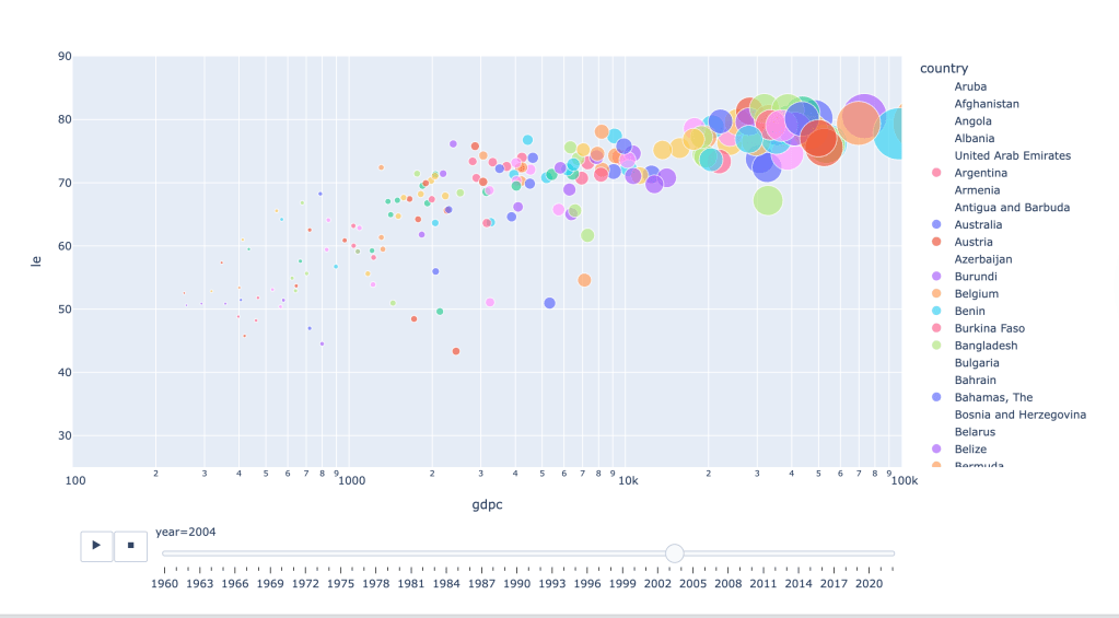
Python provides a various code to create both static and dynamic charts. Below the chart is the dynamic bubble chart talking about the correlation between life expectancy and GDP per capita (USD 2015 value). The data comes from World Development Indicator (WDI). To see the animation, just click the Play button.

Leave a comment